14. April 2021
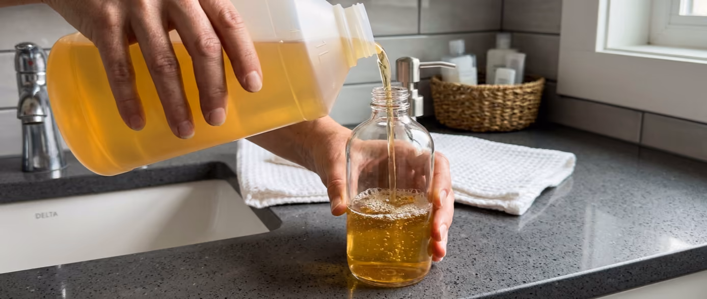
Packaging in the same packaging category often varies in size, design and color composition. What we remember is, among other things, the name of the product, but also its label, which is a large part of the visual appearance of the product. In other words, a well-thought-out label design can have a big impact on keeping your product firmly in the consumer's memory.
A strong brand with a well-known and specially designed packaging will probably be recognizable even without a label. However, in most cases, and especially when brand owners use standard packaging, it will be difficult — without a label — to distinguish the products from each other. Therefore, a label design that clearly communicates and supports your brand is most often necessary.
You can actually go a long way with a good label design on a standard packaging. It's simple to have in-depth knowledge of your target audience and communicate exactly what they want. A good example is this label design from Änglamark, which we will discuss in more detail.

There is no such thing as right and wrong when it comes to label and label design. However, there are some elements that can be beneficial to take into account. These design parameters can help ensure that your product partly stands out and partly appeals to the right audience.
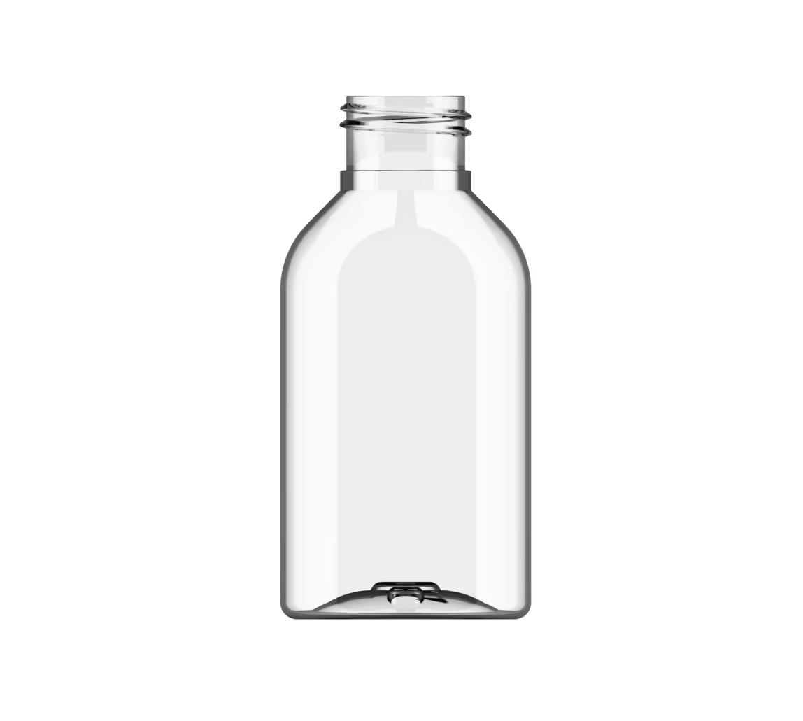
COOP Änglamark baby lotion is an example of the good label design that takes into account both visual elements and font. The hand-sketched and simple red snail on the label clearly illustrates that the product is intended for the smaller children. Likewise, the round and 'soft' font used for “baby lotion” is further accommodating qua small writing that given a soft visual expression as opposed to a solution with capital letters “BABY LOTION”.
The color palette of the transparent “wrap around” label consists primarily of the familiar shades of green, which signal the natural and healthy. A distinctive Änglamark trade-mark that supports the centrally placed “no perfume” and “no colour” claims, again telling the consumer that we are dealing with the healthier alternative. In all its simplicity, Änglamark has built the label with few graphic elements that are easy for the consumer to decode. Including the well-known Angelic Land shoe label in the solid square supported by the quality stamps from Asthma Allergy Denmark and Ecolabel, respectively. Fewer is meer!
Are you interested in hearing more about what we can offer within label and packaging design, please contact us below
Do you have any questions for us? Please do not hesitate to contact us immediately. Contact us here
We have a lot of different products and packaging.
Explore our product catalogue. Go to product catalog

You are always welcome to contact us. Whether it is sparring, a concrete inquiry or ideas for cooperation and development, we are happy to engage in dialogue and look at the possibilities together.