14. April 2021
The choice of color is an important part of the design process, as it has a great impact on the expression of your product. You can work to evoke specific associations in the consumer through your choice of colour, packaging and design. But how do you choose the right color?
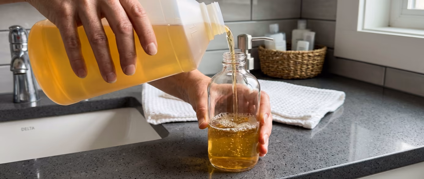
It can be difficult to describe the color you want your packaging to have. Army green, dark blue and pink look different, depending on who you ask. At Packwise we therefore use the colour system 'Pantone Matching System'. Using this system, you can choose exactly the color that you want for your packaging. The pantone colors are systematized with identification in the form of numbers, which makes it easy to exchange information about the colors. The system ensures that you get the specific color you want.

In cosmetics and personal care, there is a particular focus on aesthetics and the visual elements. Therefore, packaging is an important factor in this industry. Your packaging allows you to differentiate your product from that of your competitors.
Color selection is an extremely important element of your packaging communication that can support your branding. However, it requires thorough analysis and great consideration, so that your color choice does not end up antagonizing your brand's image. With colors, you have the opportunity to implement your brand's most important messages in your packaging. For example, a green color can symbolize concern for the environment. Your color choice can also reveal your target audience. Especially in the field of personal care, dark colors can point out that you are addressing men.
It can be difficult to predict what signal your packaging sends to consumers. Colors can cause different associations among consumers, which can result in different perceptions of your brand and product. The color of your packaging can therefore be a difficult choice that requires careful consideration. At Packwise, we are always ready to assist you throughout the development and design process.
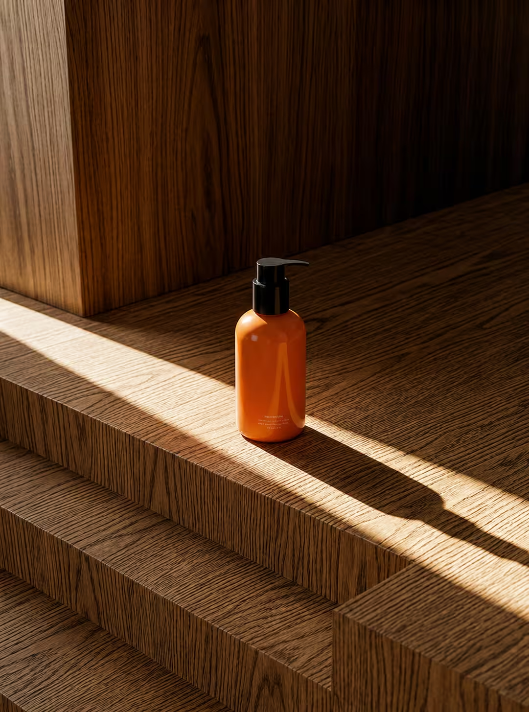
The skin care and cosmetics brand Origins focuses on colors in their designs. They make use of powerful colors, creating a cohesion in the product lines and catching the consumer's gaze on the shelves. Each product is adorned with a color, which is used to create associations with the product's benefits and ingredients. For example, the product line 'GinZing' is found in Origin's range, where the packaging has a fiery orange color. Orange is often associated with healthy, juicy fruits, vitamin C, warmth and energy, which is consistent with the purpose of GinZing products: to give the skin a fresh, healthy and radiant glow.
If you are interested in hearing about what we can do for you ift. development and design of packaging, then contact us here.
Do you have any questions for us? Please do not hesitate to contact us immediately. Contact us here
We have a lot of different products and packaging.
Explore our product catalogue. Go to product catalog
You are always welcome to contact us. Whether it is sparring, a concrete inquiry or ideas for cooperation and development, we are happy to engage in dialogue and look at the possibilities together.